From small startups to established corporations, companies across all industries are leveraging Facebook’s advertising platform to achieve their marketing goals. In this blog post, I’ll dissect some outstanding Facebook ad examples of all ads types, analyze their strategies and uncover the secrets behind their success. I believe that even a cool Facebook ad example will provide valuable insights and inspiration for your next Facebook ad campaign. So let’s jump right into it!
Contents
The Formula for a Good Facebook Ad
Before we dive into the examples, let’s discuss what constitutes a good Facebook ad. Here are some key factors:
- Relevance: The ad should be relevant to the audience it’s targeting. This means understanding your audience’s interests, needs, and wants.
- Visual appeal: A good ad is visually appealing. It should have high-quality images or videos that grab the viewer’s attention.
- Clear message: The ad should have a clear message. It should be easy for the viewer to understand what the ad is about and what action they should take.
- Strong Call-to-Action (CTA): A good ad has a strong CTA. This could be something like “Shop Now”, “Learn More”, or “Sign Up”.
Now, let’s take a look at some of the best Facebook ad examples and see how they incorporate these elements.
Best Facebook Photo Ad Examples
Photo ads use a clean, simple photo or illustration, together with an engaging ad copy to convey your message.
1. 360Learning
360Learning is a company that develops a collaborative learning solution to help companies unlock learning based on collective expertise.
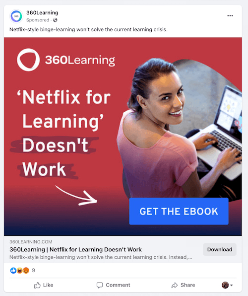
The company’s Facebook photo ad campaign is one of the best examples of creating demand and urgency. It reads: “Netflix-style binge-learning won’t solve the current learning crisis.” Then invites you to download an ebook on the topic. This ad likely worked because it addressed a current issue (the learning crisis), offered a unique perspective (contrasting their approach with “Netflix-style binge-learning”), and provided a clear CTA (downloading an ebook).
Why it worked:
- Offering a unique perspective: The ad offered a unique perspective by contrasting their approach with “Netflix-style binge-learning”. This not only made the ad stand out but also positioned 360Learning as a thought leader in the e-learning space.
- Providing a clear CTA: The ad included a clear CTA – inviting viewers to download an ebook on the topic.
- Educational value: The ad provided educational value by offering an ebook on the learning crisis.
2. Tentsile
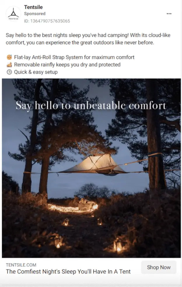
Tentsile is an innovative outdoor equipment company that has redefined camping and outdoor experiences with its revolutionary tree tents. In this Facebook ad example, Tentsile wants to showcase its unique product in a visually appealing way that resonates with its target audience.
Why it worked:
- Visual appeal: Tentsile’s products are visually striking. The unique design of their tree tents, coupled with the natural settings, creates compelling imagery that draws the viewer’s attention.
- Emotional appeal: This approach addressed consumers’ emotional and physical yearnings for comfort, building compelling and persuasive ad campaigns.
- Attention grabbing: The opening statement, “Say hello to the best night sleeps you’ve had camping,” immediately grabs the reader’s attention by addressing a common pain point of uncomfortable sleep while in the great outdoors.
Ideal Facebook Ad Examples for Video Ads
Facebook video ads allow you to tell your brand’s story with sight, sound, and motion. This ad type comes in various lengths and styles, from short feed-based ads to longer videos.
1. Kay Jewelers
The “Every Kiss Begins with Kay” campaign by Kay Jewelers has utilized Facebook video ads to connect with its audience and promote its products.
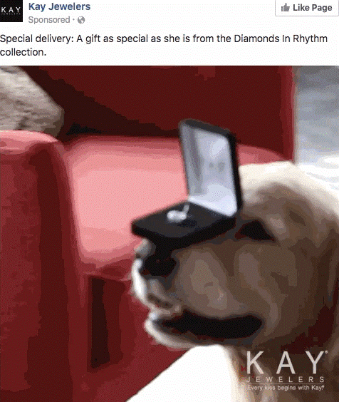
In this Facebook ad example, Kay Jewelers promotes their Valentine’s Day sale with a video featuring a couple celebrating their love with Kay Jewelers products from ‘Diamonds in Rythm’. In just a few seconds, Kay Jewelers has succeeded in telling quick but moving stories. Just by looking at the reaction of pure happiness from the woman when receiving the beautiful gift from her counterpart, you know this present is worth more than any words can tell.
Why it worked:
- Authenticity: Kay Jewelers uses real couples in their commercials to communicate and connect with genuine love.
- Storytelling: The ads tell a story, evoke emotions, and showcase their products in a way that resonates with their audience.
- High-quality production: Kay Jewelers worked with Nabil Elderkin, a director known for his ability to bring authentic love to the screen, to create cinematic scenes involving Kay jewelry.
2. Allbirds
The Allbirds’ ad for its new Dashers running shoe is filled with striking visuals and a clear value proposition. This Facebook ad example, in its 15-second duration, showcases the product’s unique selling point – its comfort and sustainability, in a straightforward, yet effective way.
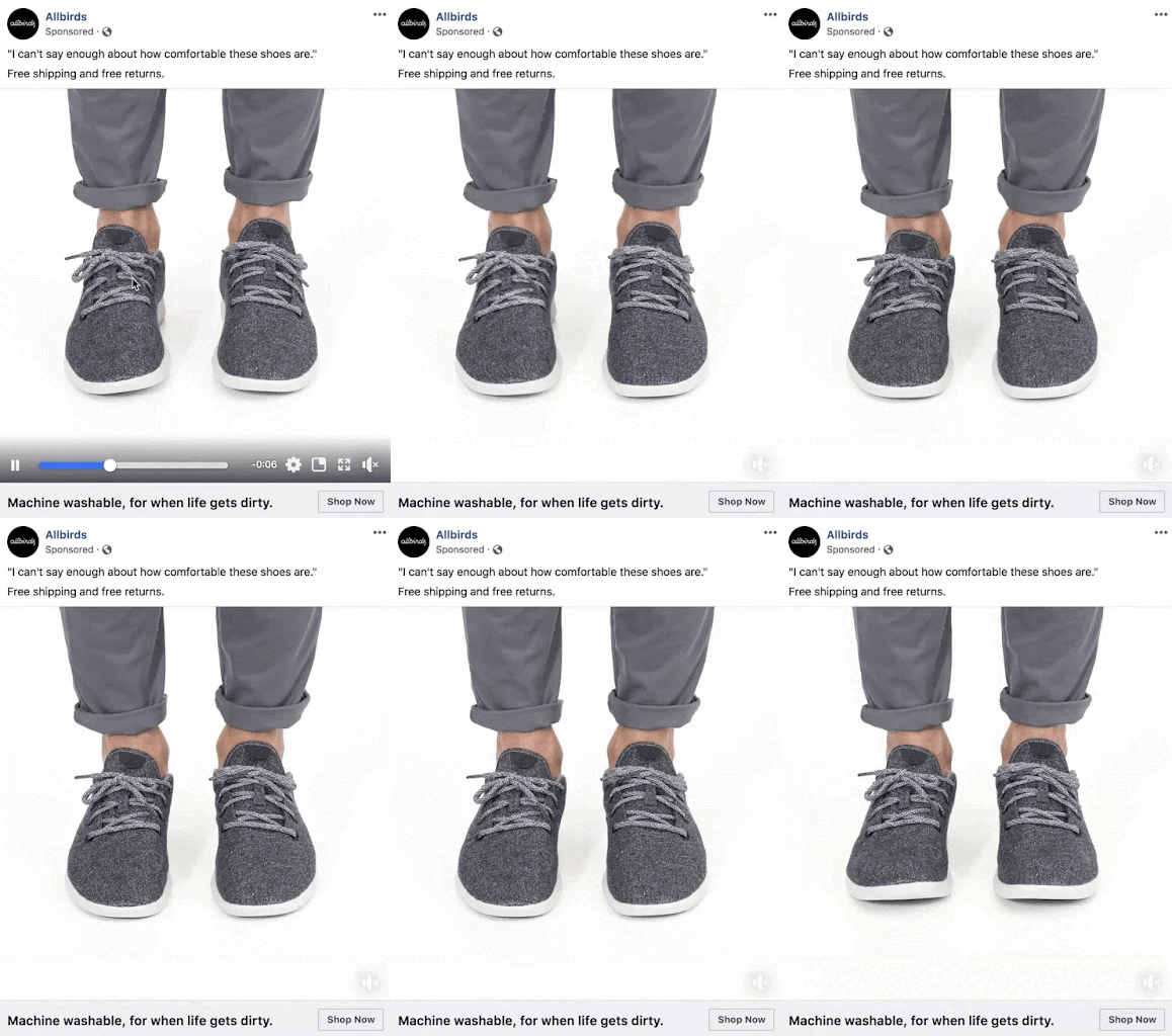
It showcases a man sporting a pair of Allbirds shoes and trousers with rolled-up cuffs. Throughout the seven-second video, the man continually flexes his feet, adjusts in his shoes, and stands on his toes. The headline perfectly captures the essence, proclaiming, “I can’t say enough about how comfortable these shoes are.” This statement says it all!
Why it worked:
- Unwavering focus: The ad emphasizes the brand’s new product’s unique selling proposition, comfort, and nothing more. The message is being delivered to the users in the most direct way possible.
- Product features highlight: As indicated in the text at the bottom, the shoes are also machine washable.
- Visual emphasis: The camera maintains a steady focus on a sequence of movements performed by the wearer’s feet to show how flexible the shoes are.
>>> Read more: 9 Facebook Video Ads Examples that Inspire Your Next Campaigns
Sample Facebook Ads for Story Ad Type
With Story ads, you can create customizable, edge-to-edge experiences that immerse people in your content. Stories allow you to tap into passions and inspire action on mobile devices.
1. Datadog
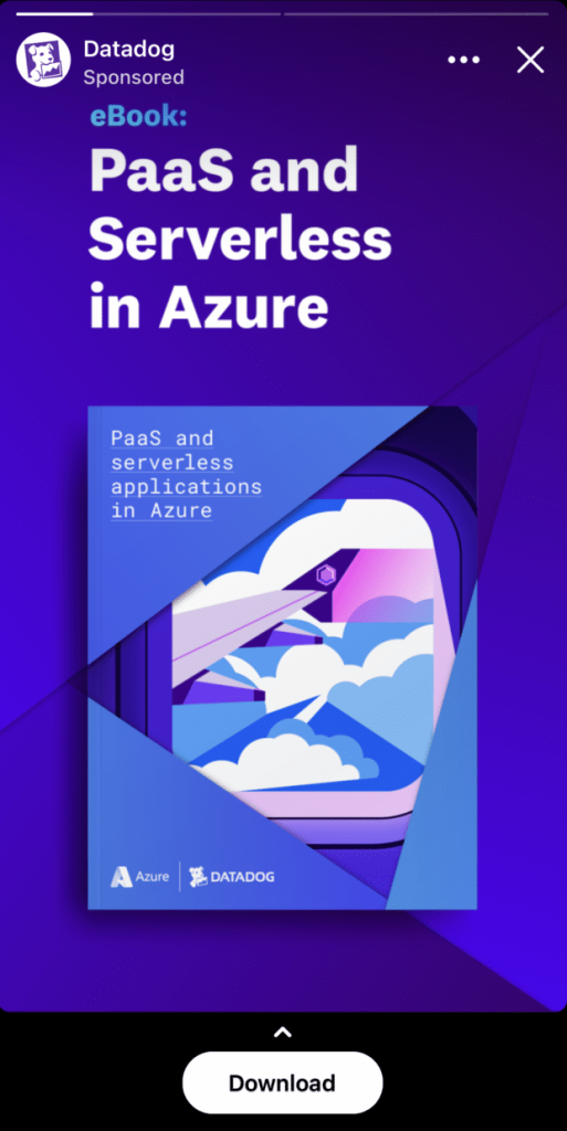
To encourage users to download the ebook “PaaS and Serverless in Azure” and make the download process as easy as possible, Datadog utilized the Story ad type.
Why it worked:
- Compelling CTA: The “Download” CTA is straightforward and action-oriented. It prompts users to take a specific step Datadog wanted.
- Visual impact: The use of dynamically strong color patterns catches the eye within the Stories format. Bold colors stand out against the background, drawing attention to the ad.
2. Udemy
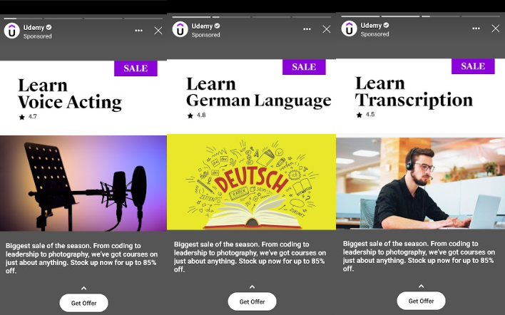
Udemy is an education technology company that provides an online learning and teaching platform at a global scale. Due to the large number of courses available on the platform, it was difficult for Udemy to make its courses stand out from the rest. They needed a way to present the breadth of their course offerings in an engaging way, and prompt immediate action within the short attention spans of potential learners.
Why it worked:
- Stories allow Udemy to showcase snippets from its various courses across different fields, giving viewers a quick taste of the learning experience.
- Highlight offer: The ‘Sale’ text box at the top right corner of the visual, along with the headline ‘Stock up now for up to 85%’, are well highlighted, encouraging viewers to quickly make a purchase.
- Immediate action: The swipe-up link simplified the enrollment process and encouraged viewers to take immediate action upon discovering relevant courses.
Good Facebook Carousel Ad Examples
Facebook carousel ads can showcase up to ten images or videos in a single ad, each with its own link. With this ad type, you have the agency to highlight different products or tell a brand story across multiple cards.
1. Shutterfly
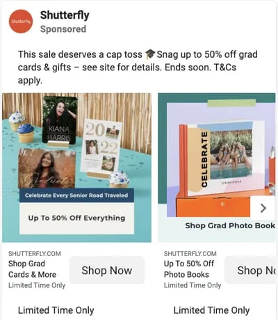
With its wide range of products and services, Shutterfly needed a creative and engaging way to show that to its audience. That is why the company opts for Carousel ad, an ad types that allow businesses to showcase various products or offers.
Look at this Facebook ad example, we can see each image presents a distinct offer, catering to a wide range of demographics within a single ad. In every image, the promoted product maintains a consistent aesthetic that aligns with the Shutterfly brand. This consistency is a crucial aspect of ads that display multiple items and images.
Why it worked:
- Visual appeal: Shutterfly’s products are visually striking. The unique design of their photo books and the quality of their prints create compelling imagery that draws the viewer’s attention.
- Relevance: Shutterfly’s ads are tailored to their target audience. They highlight moments that matter to their customers, such as weddings, birthdays, and holidays.
- Value proposition: Shutterfly’s ads often highlight special offers, discounts, or exclusive deals. This provides a clear value proposition and encourages viewers to take action.
2. Bombas
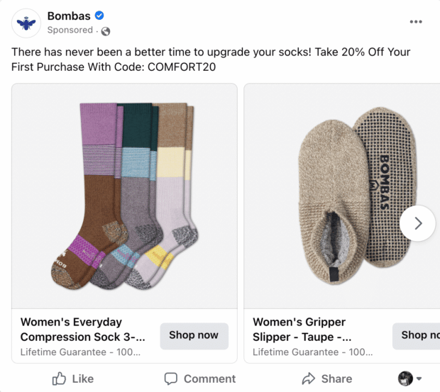
In the Facebook ad example by Bombas, the sock company features a 20% off promo code in the headline, instantly attracting potential customers. The carousel format of the ad enables viewers to browse through a variety of products before making a purchase decision, all the while reminding them of the enticing discount available.
Why it worked:
- Multiple products, one story: Unlike static image ads, carousels allowed them to showcase a variety of products within a single ad.
- Interactive experience: The swipeable nature of the carousel ads encouraged potential customers to explore the variety of products offered by Bombas.
- Educated customers: By showcasing various products and their features, Bombas educated potential customers about their offerings, clarifying their brand value proposition.
Successful Facebook Ads for Slideshow Ad Type
Facebook slideshow ads use the combination of motion, image, and text to help advertisers achieve their marketing goals. They work beautifully across devices and connection speeds.
1. Jasper’s Market
To highlight its product range and convince to customers, Jasper’s Markets, a grocery store, chose to use Slideshow ads on Facebook.
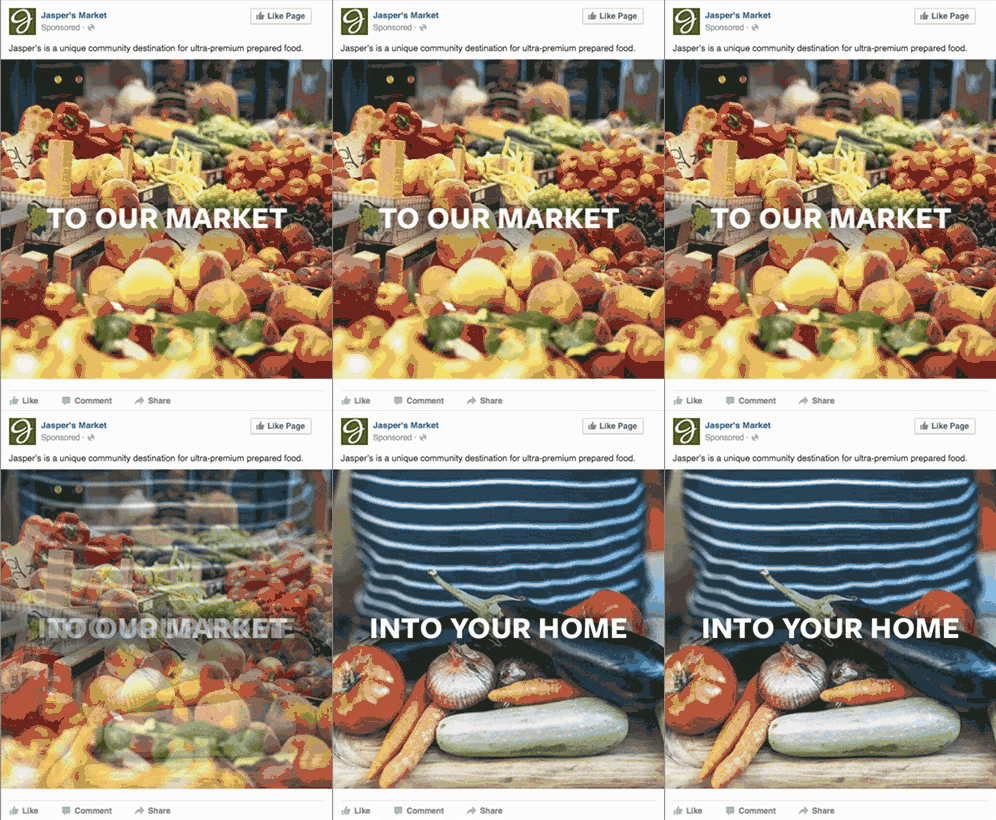
The ad has two images. The first one showcases the fresh products of the market, accompanied by the text “To our market”. This invites viewers to imagine themselves visiting the market and experiencing the freshness and quality of their products firsthand.
The second image, with the text “Into your home”, shows their products being displayed in a home setting. This helps viewers visualize how Jasper’s Market’s products could fit into their own lives and homes.
Why it worked:
- Simplicity and clarity: The ad was simple and clear, with just two images and short, concise text. This made it easy for viewers to understand the message that Jasper’s Market was trying to convey.
- Storytelling: The ad effectively communicates the journey of their products from the market to the customer’s home, highlighting the freshness and quality of their offerings. This storytelling approach is more engaging than simply listing products or services.
2. Felix Gray
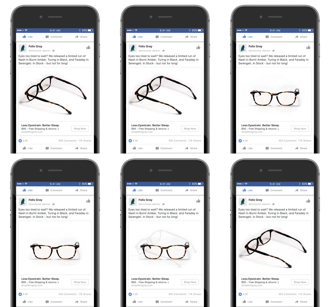
Felix Gray is a New York-based company that designs and manufactures blue light filtering glasses, aiming to alleviate digital eye strain. In an attempt to promote their limited products, the company used a Slideshow ad. The ad shows off different items from your entire collection, all from different angles as well.
Why it worked:
- Visual appeal: By showing different angles of their products, Felix Gray not only showcases the quality and design of their eyewear but also helps customers visualize how the glasses might look on them.
- Clear value proposition: The headline “Less eyestrain. Better sleep” immediately communicates the benefits of Felix Gray’s products. Concisely, it addresses a common problem (eyestrain and poor sleep) that many potential customers can relate to, especially those who spend a lot of time in front of digital screens.
Best Facebook Collection Ad Examples
Facebook collection ads let people discover, browse, and buy what you offer. Users can tap an ad to learn more about a specific product within a fast-loading experience1.
1. Dollar Shave Club
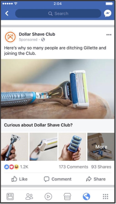
Dollar Shave Club is a company that offers high-quality razors and grooming products at affordable prices. Well-known for its humorous ad campaigns, this rather straightforward promo from Dollar Shave Club, utilizing Facebook Collection ads, performed incredibly well.
Why it worked:
- Straight to the point: The ad features a short ad headline, ad copy, and images showing different angle shots of the razor.
- Clever ad copy: The curiosity-driven copy and competitor call-out were enough to pique users’ interest and likewise drive them to the comments section.
2. Zales
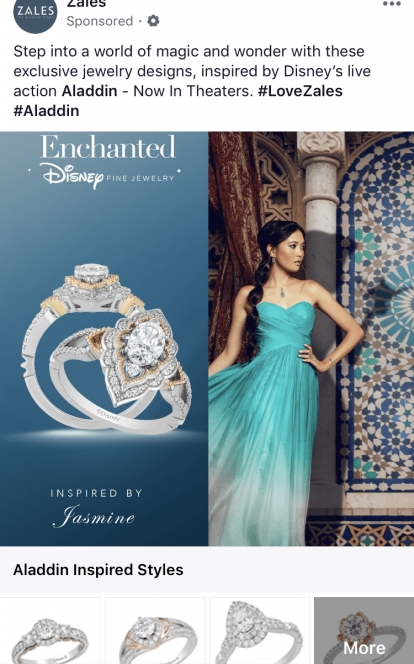
Zales, a jewelry company, strategically crafted an ad campaign centered around a highly specific niche: Disney’s live-action engagement rings.
Why it worked:
- Emotional connection: Disney is associated with magical moments and fairy tales. Potential customers, upon seeding the ad, can envision their own romantic stories, making the rings more appealing and memorable.
- Uniqueness: The ad highlights the rings’ uniqueness. Customers seeking distinctive, one-of-a-kind pieces are drawn to these Disney-themed rings. The rarity factor increases their desirability and encourages conversions.
Great Facebook Ad Examples for Messenger Ads
Facebook messenger ads allow current or potential customers to start conversations with your business. You can add interactive or automated features to engage users.
1. Sephora
Sephora, a global leader in prestige beauty retail, has effectively used Facebook Messenger ads to engage with its customers.
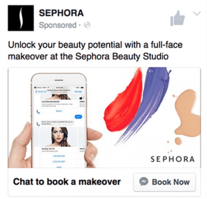
The ad featured a clear “Book Now” button that directly brought users to Sephora’s Messenger. Upon clicking the CTA button, users were guided by a chatbot through the booking process. The chatbot offered recommendations based on user preferences.
Why it worked:
- Clear CTA: The ad featured a clear “Book Now” button, which made it easy for users to understand what action they were expected to take.
- Direct interaction: When users clicked the CTA button, they were taken directly to Sephora’s Messenger. This direct interaction can create a more personal and engaging experience for users, which can lead to higher conversion rates.
- Guided process: Users were guided by a chatbot through the booking process. This guidance can make the process easier and more efficient for users.
2. Nikuya
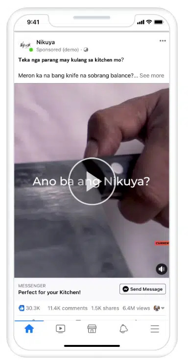
Nikuya, a Filipino kitchen knife retailer, utilized Messenger ads to start engaging with their customers. When people clicked the ads, a Messenger window opened, inviting them to interact with the brand’s digital assistant, ask questions, and place orders.
Why it worked:
- Immediate response: With the digital assistant ready to answer questions and take orders, customers could get immediate responses to their inquiries.
- Ease of use: The process of clicking the ad and being taken directly to a Messenger window is seamless and easy for users.
- Personalized experience: The assistant provided personalized product recommendations based on the user’s preferences.
>>> Read more: 6 Facebook Messenger Ads Examples that Inspire Your Next Campaign
Facebook Lead Ad Examples that Actual Converted
Facebook lead ads simplify the lead generation process by allowing people to tap an ad and instantly submit a pre-populated form with their Facebook contact information. This ad type is mobile-friendly, reduces drop-offs, and can be customized for various objectives.
1. Audi Denmark
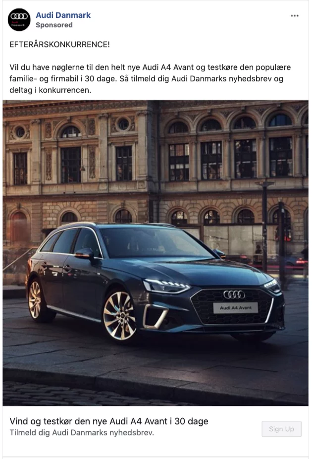
Audi Denmark, a leading luxury car brand, aimed to generate leads and increase test drives for their new car model launch. Audi Denmark needed to reach a wider online audience and capture qualified leads interested in experiencing their new car firsthand. That’s why the company chose to use Facebook Lead ads.
Why it worked:
- Reduced friction and convenience: The ease of expressing interest directly within the ad, combined with the pre-populated information from Facebook profiles, likely led to a higher volume of leads.
- Engaging offer: Instead of offering a generic discount, Audi Denmark offered a compelling incentive: a chance to win a 30-day test drive of the new car model Audi A4. This incentive likely motivated users to submit their information for entry.
2. Sleeknote
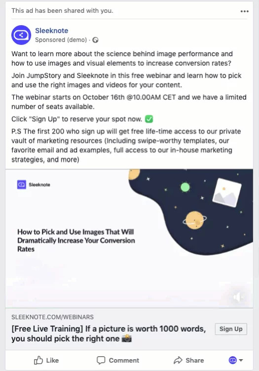
Promoting your webinars with paid advertising is the key to driving high-quality, targeted event signups. If you are holding an event, and want to attract as many people as possible, using lead ad is an effective way to do so.
Look at this Facebook ad example below by Sleeknote. The ad starts by asking a question that targets our prospects’ pain points and continues with a clear description of the event. The goal is to make sure that users know what they’re signing up for, and the video helps users with that, as well.
Why it worked:
- Simple contact form: The form only has three input fields, streamlining the process for users to submit their information.
- Sense of scarcity: The company only provides special incentives to the first 200 signups, which helped to boost the number of registrations in a short time.
- Wider reach: The ad has two versions, one in English and the other in Danish. These ads are targeted to lookalike audiences of our existing subscribers who have demonstrated high engagement.
>>> Read more: Top Facebook Lead Ads Examples & Updated Insights for 2024
Intriguing Facebook Playable Ad Examples
Facebook playable ads offer an interactive preview before users download an app. This “try-before-you-buy” experience helps find higher-intent users for your app.
1. Lego Friends
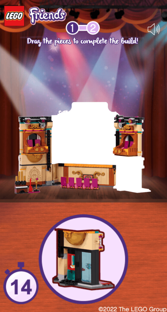
Lego Friends is a product line of the Lego construction toy. To advertise the new product, Lego decided to display the concept of assembling the pieces, typical of its products, with a simple but still enjoyable playable.
In this mini game, the players have to assemble a Lego house by dragging the pieces. At the end of the ad, the users have engaged with the brand and their attention has been captured by the new product.
Why it worked:
- Interactive experience: The ad allowed users to engage with the product in a fun and meaningful way, which is more impactful than passive viewing.
- Brand engagement: Users were not just watching an ad but were actively engaging with the Lego brand. This increased the chances of users remembering the brand and the specific product.
- Product showcase: The ad effectively showcased the unique selling proposition of Lego products – the joy of assembly. Users could experience the process of building with Lego, which could make them more likely to purchase the product.
2. Monster Legends
Monster Legends has adopted Playable ads into their digital strategy, with an attempt to give them a point of difference and drive more downloads to the game.

Why it worked:
- Gameplay showcasing: The ad provided a hands-on teaser of the game, allowing users to experience the gameplay before downloading the app.
- Downloads encouragement: Users who enjoyed the teaser are more likely to download the full game to continue their experience.
How to Create Your Own Successful Facebook Ads?
Now that we’ve looked at some of the best Facebook ads examples, let’s discuss how you can create your successful ads. Here are some tips:
Start Using Facebook Agency Ad Account
Having a Facebook agency Ad account can significantly enhance your ad campaigns. An agency account allows you to manage multiple ad accounts, pages, and permissions all in one place, making it easier to track performance and make adjustments. It also provides access to advanced tools and insights that can help optimize your campaigns for better results.
As the name suggests, you cannot create a Facebook Agency Ad Account of your own. This type of account is exclusively accessible to top-tier digital marketing agencies, like Mega Digital. If you want to have a Facebook Agency Ad Account that will streamline your ad creation process, Mega Digital is here to offer you one.
Understand Your Audience
Before you start creating your ad, you need to understand your audience. What are their interests? What problems are they trying to solve? The more you know about your audience, the more relevant your ad will be.
Write a Clear, Compelling Message
Your ad’s meseage should be clear and compelling. It should be easily understood by the audience, leaving no room for ambiguity or confusion. On the other hand, a compelling message is one that creates interest, evokes emotions, and motivates the audience to take a desired action. Make sure to highlight the benefits of your product or service and why it’s the best solution for your audience.
Incorporate a Strong Call-to-Action (CTA)
Finally, don’t forget to include a strong CTA that tells the audience what action they should take next. It’s the part of the ad that motivates the audience to move from passive viewing to active engagement. It should be clear, compelling, and aligned with your campaign goals to guide users toward the desired action.
Wrap-up
The Facebook ad examples we’ve explored in this blog post illustrate the diverse and creative ways businesses can leverage Facebook ads to connect with their audience. From compelling visuals to engaging copy, these examples offer valuable insights into effective Facebook advertising strategies. Hopefully, these examples will serve as your inspiration for crafting impactful and successful Facebook ad campaigns of your own.
