Google Universal App Campaign (UAC), has various placements within the Google Display Network. It is therefore important for advertisers to have their ads coming in diverse ad specifications to ensure they perform effectively across all platforms. This blog is everything you need to know about Google App campaign specs and their creative asset requirements.
QUICK SUMMARY
- Google App Campaigns get assets in two ways: by uploading custom text, images, and videos, or by pulling them directly from the app store listing.
- Text assets (headlines & descriptions) are mandatory, while image and video assets are optional but highly recommended for better performance.
- Specs include strict limits: up to 5 headlines (30 characters), 5 descriptions (90 characters), 20 images, and 20 videos, all optimized for multiple ad placements.
- Common formats range from small mobile banners (320×50) to larger interstitials and leaderboards, each suited to different placements.
- Best practices: tailor creatives for each platform, preview and A/B test before launch, and use Google’s asset reporting to optimize performance.
Methods for App campaign to get assets
There are 2 ways for an App campaign to obtain assets, you have the option to either upload your own asset or retrieve assets from your app’s store listing page:
Uploaded assets
When setting up a campaign, you have the option to upload desired assets. While text assets are mandatory, it is advisable to upload other types such as images and videos.
There are 3 essential creative types to provide:
- Text (the only thing that is compulsory)
- Headlines
- Descriptions
- Image
- Video
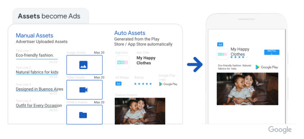
App store assets
UAC can also retrieve assets from your app’s store listing page. This includes your app’s icon, title, rating, and screenshot images.
Requirements for Google App Campaigns ad assets
Let’s take a look at each of these Google App campaign specs:
App campaign text assets
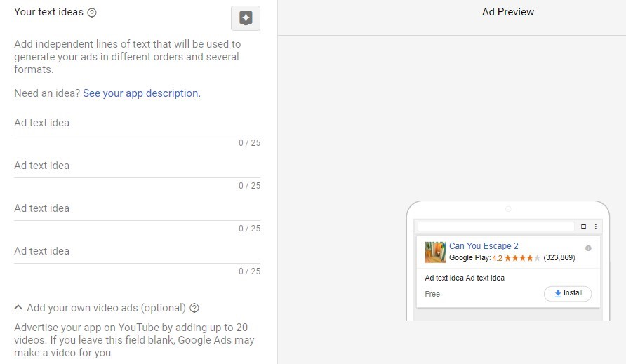
You have to give UAC some ideas for your ad text. The provided text will be used to create your ads in various sequences and formats. When considering text ad elements, keep in mind that they will display in different layouts across various networks.
Potential users could encounter your app in different scenarios—some might be watching a YouTube video, while others could discover it in the Google Play Store. In both instances, the first thing users will notice is your app’s title.
Requirements
Text asset concludes headlines and descriptions.
- Headlines: Include a maximum of 5 headlines, with each headline containing 30 characters or fewer.
- Descriptions: Provide a maximum of 5 descriptions, ensuring each description is 90 characters or fewer.
Recommendations
- Ensure your headlines/descriptions text has value even without the other.
- Make your app easy to find on the Google Play Store by optimizing the title – a key factor in App Store Optimization (ASO). This practice is also effective for App campaign.
- When optimizing your app’s title, keep it straightforward. It should convey the app’s purpose clearly to everyone.
- Avoid repeating keywords from the app title. Instead, highlight another positive aspect of your app or provide additional information related to the title.
App campaign image assets
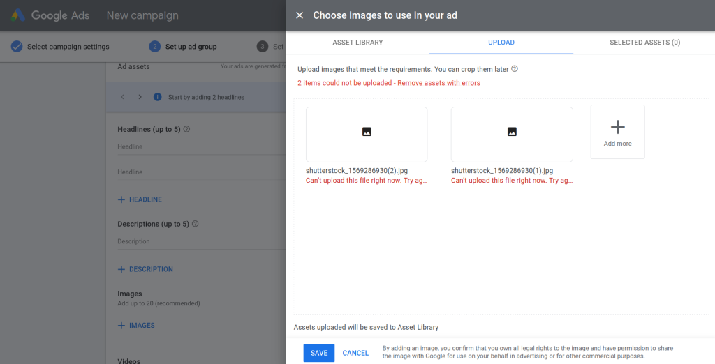
If you’re feeling a bit lazy, you can pass on this step. The only necessary ad asset for UAC is text. However, having more control over creative assets is beneficial. With numerous placements, there are various potential image types and dimensions.
Google advises uploading numerous images. Aim to upload as many as you can. For native ads, landscape images are the most valuable format, and for interstitial ads, portrait images work best.
Requirements
- Formats: .jpg, .png (.gif is no longer accepted)
- Size: < 1MB
- Dimensions: 320 x 480 px, 320 x 50 px, & 300 x 250 px
Recommendations
- Use relevant images with simple text
- Use in-app images
- Make sure the images are high-quality (high pixel density)
- Include a CTA in the text

App campaign video assets
To link video ad materials to App campaign, you must first upload videos on YouTube.
The video can be in landscape, portrait, or square orientation. If you don’t have a preferred video for your UAC, Google can use a video from your app’s listing on the Google Play Store.
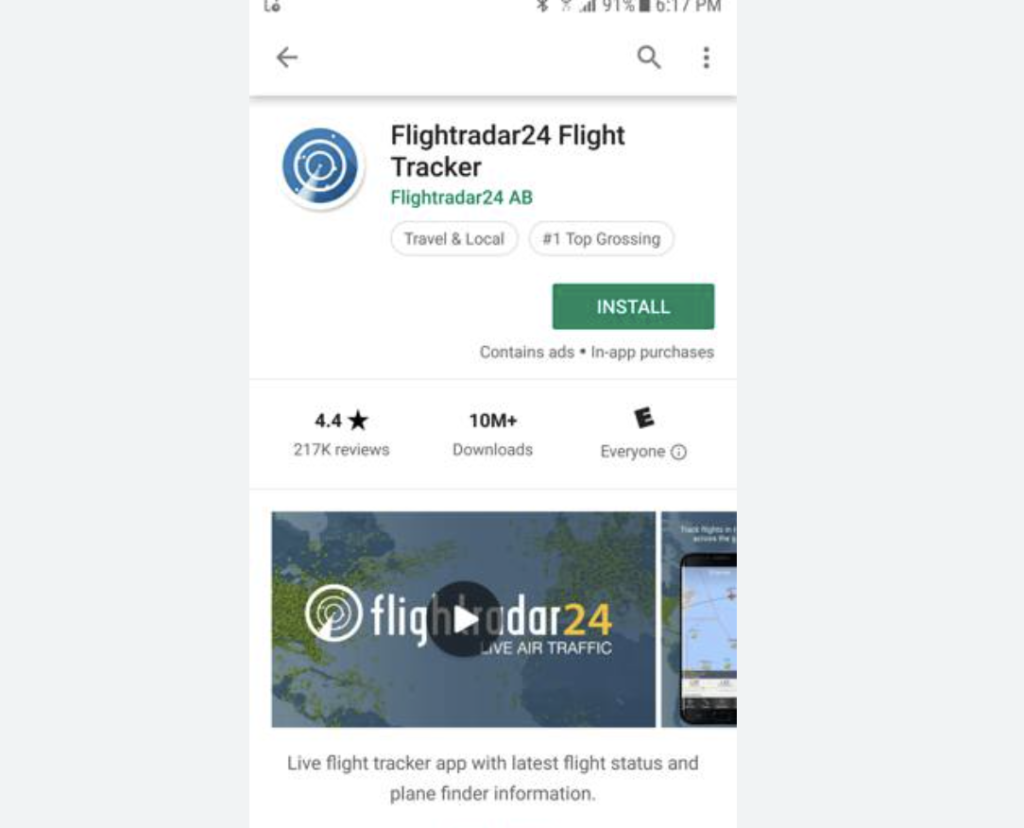
Remember, the minimum video length required for app campaigns is 10 seconds.
Video creatives often yield better results, attracting more valuable users. If a picture is worth a thousand words, just imagine the impact a video can have on showcasing your app.
Users who watch a video about your app gain a clearer understanding, making them more likely to become engaged users.
Requirements
- Orientation: 16:9 (landscape), 2:3 (portrait), and 1:1 (square)
- Resolutions: 1920×1080 (landscape), 1080×1620 (portrait), 1080×1080 (square)
- Video duration: 10-30 seconds
Recommendations
- The more videos, the better. Recommended uploading two squares, two portraits, and two landscapes, testing what could happen, and then changing accordingly due to their efficiency.
- Make it short because the video assets on UAC campaigns are not suitable for storytelling. They should be tailored to capture the audience’s attention.

Most common Google App campaign specs
You can upload a maximum of 20 images and 20 videos for your Universal App Campaign (UAC). Different ad placements within the Display Network require specific image dimensions. Here are the most common Google UAC ad dimensions for you:
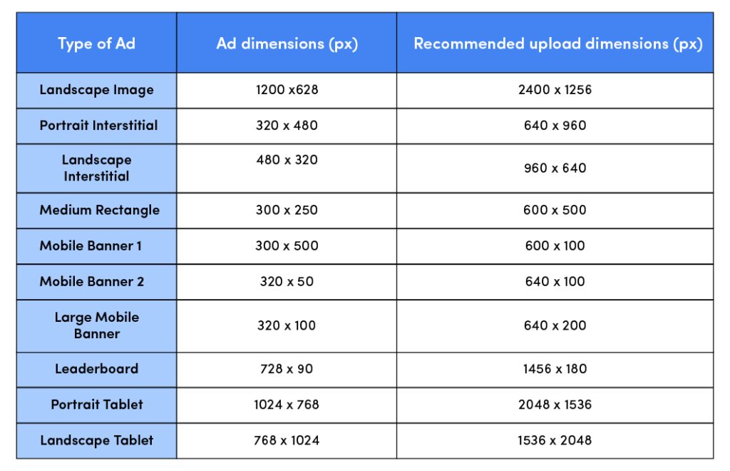
Mobile Banner 1 (320 x 50 px)
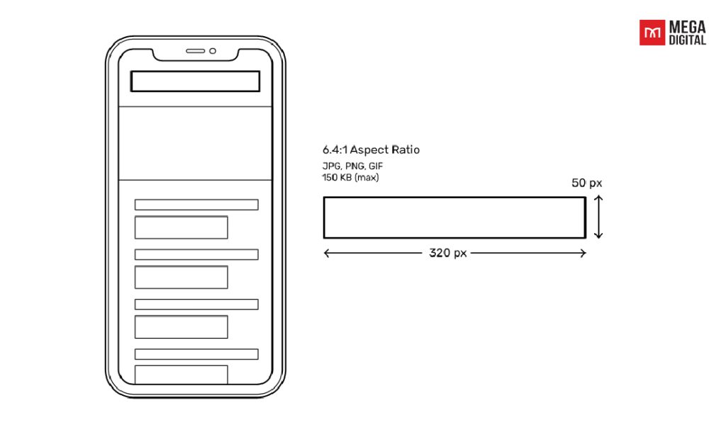
The Google App campaign specs of 300×50 is a small but decent option to make money from mobile traffic on your site. Try it for a few months, and see if it earns you anything while keeping an eye on any potential loss of visitors. These ads are tiny but cost-effective and can reach users at more different points than desktop ads.
One thing to remember is to keep your UAC’s message clear and graphics simple to get your point across in this small space.
Mobile Banner 2 (320 x 100 px)
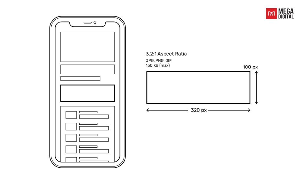
The 320×100 ad is the bigger brother of the 320×50 ad unit above, known as the Large Mobile Banner. This Google UAC specs is the largest among mobile-specific banner ads, which is a top-performing choice, especially for websites with significant mobile traffic.
While this size may not be a massive revenue driver, it can still monetize mobile ad impressions effectively. Because these ads float at the bottom of the screen, ensure you provide an easy way for users to close them to avoid annoyance. Mega Digital suggests putting in your UAC ad a concise call to action and a clear message and content.
Medium Rectangle (300 x 250 px)
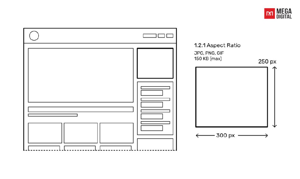
Google App specs also come in the dimensions: 300×250. This is often referred to as the MPU (Medium Rectangle), which is the most common and top-performing display advertising unit. They are quite expensive because this size allows the ads to appear on various placements: top of the right-hand column and left-hand column or within content.
When using the medium rectangle size, you should also select both the ad placement and the website as well. If there are many 300×250 ads on the same page, make sure that you’re not paying for several of them simultaneously, unless that aligns with your advertising goals.
Portrait Interstitial (320 x 480 px)
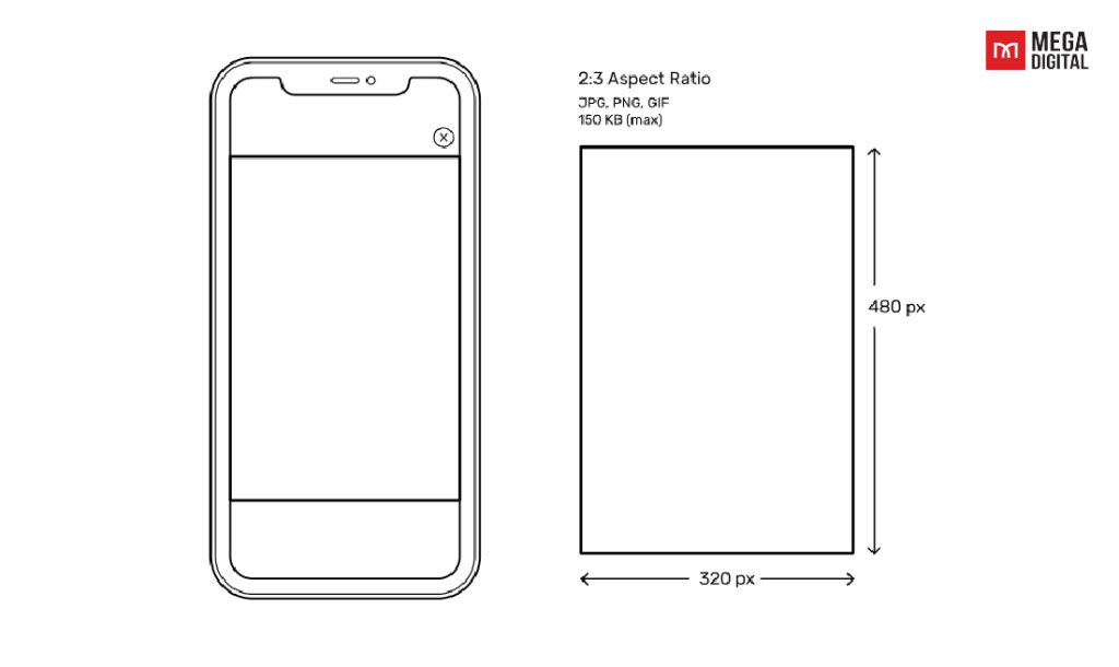
The 320×480 interstitial ad size is a full-screen mobile ad. This ad typically appears as an overlay on top of website content and is often used as an overlay.
The portrait interstitial size could be very annoying so if you don’t use it smartly, this ad could affect user experience negatively. For your Universal App Campaign, it is therefore advisable to use the 320×480 ad size on larger sites with a big user base to maximize the performance and increase Click-through-rate (CTR).
Landscape Interstitial (480 x 320 px)
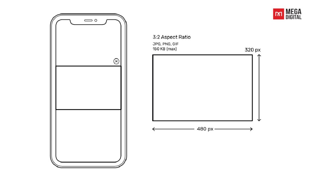
The 480×320 Banner Ad Unit, or Mobile Landscape Interstitial Ad Unit, is a large ad size that appears full-screen on smartphones when in landscape orientation or within the content of a webpage. It’s an effective choice for branding campaigns because, just like the 320×48 ad size, it is highly viewable yet less annoying. This ad unit is widely used on recipe websites and food blogs.
Leaderboard (728 x 90 px)
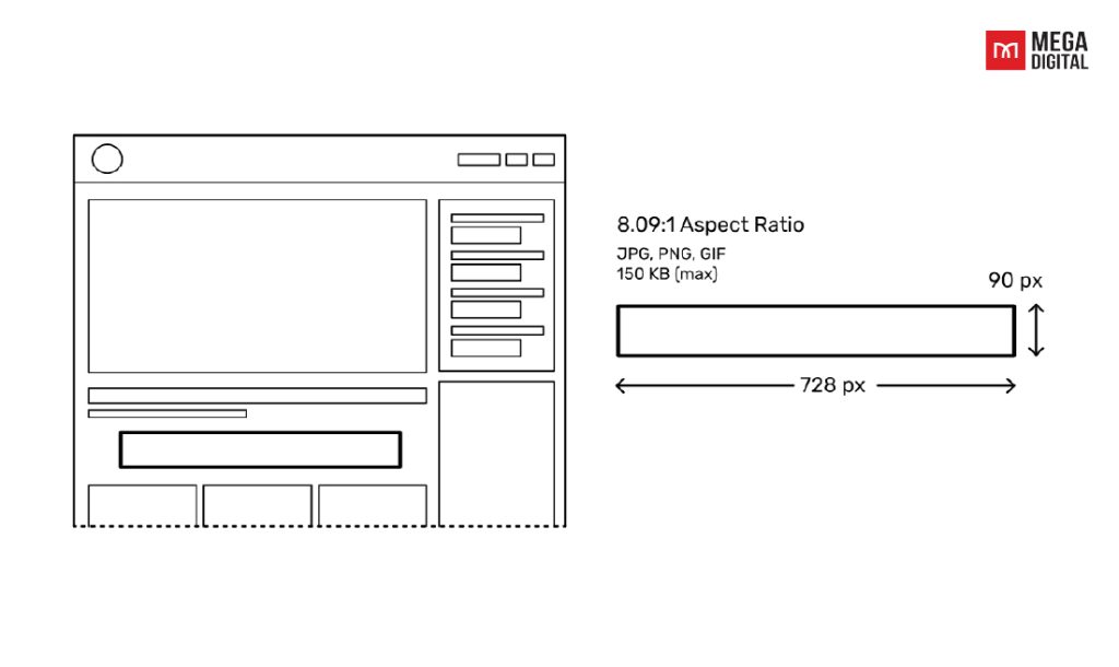
A 728×90 ad is commonly placed at the top of web pages to ensure it’s seen immediately when the page loads. These leaderboard ads are one of the most common sizes in advertising, often considered the second-best ad size after the medium rectangles. When placed at the top of web pages, they are “above the fold”, making them more likely to be noticed and clicked on.
You can value above-the-fold placements as they tend to have good performance, such as high CTR and engagement rate. However, if these ads are located within content or at the bottom of web pages, they are less likely to be seen by users and consequently earn lower revenues than the top-of-screen ones.
Tablets (1024 x 768 px)
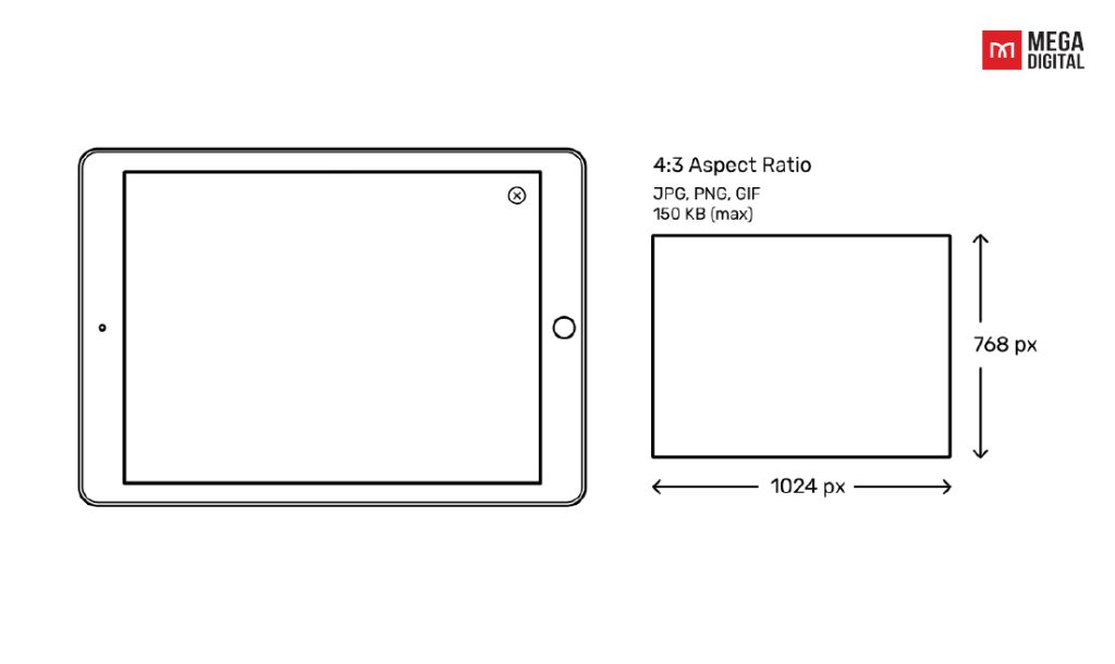
An expandable ad, known as the Tablet Landscape Interstitial Ad (1024 x 768), is designed to appear between content on tablet devices. This spec offers an interactive experience where users can engage with the ad’s content. However, to ensure a positive user experience, you should include a prominently displayed close button allowing users to easily exit the ad. It is also recommended to use this ad sparingly, as frequent interruptions may frustrate users.
>>> Read more: Top Popular Google Display Ads Sizes with Detailed Specs
Best practices for your Google App campaigns
It’s important for advertisers to optimize various Google App campaign specs on different placements on the Google Display Network. Take a look at some of Mega Digital’s best tips for running a Google App campaign to help you gain a sweet outcome.
Make different creatives for different placements
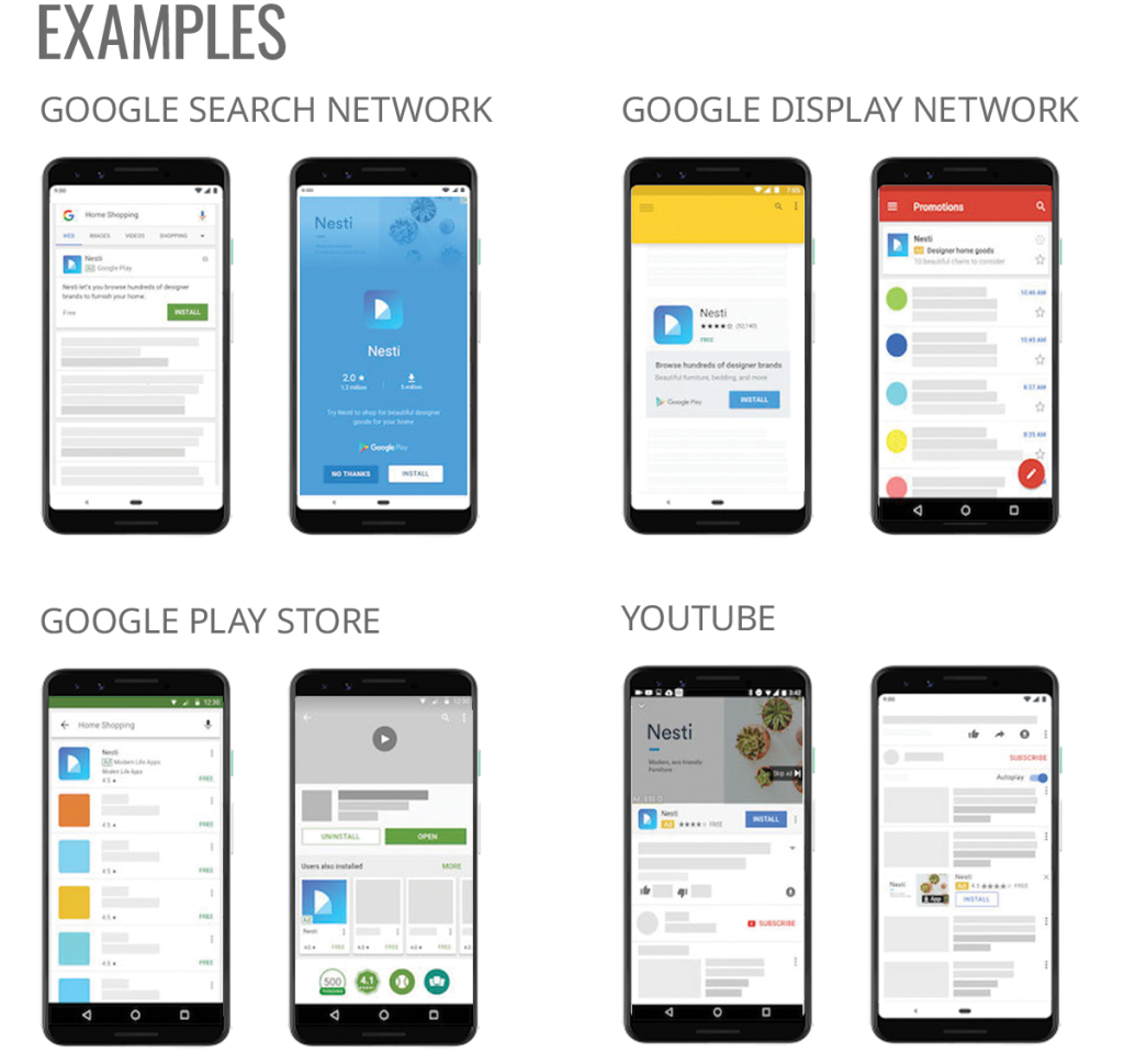
Google App ad campaigns can appear on various Google platforms, such as Google Search, YouTube, Google Play, and in various apps across the Display Network. As different Google platforms have distinctive features, you may want to take advantage of this by changing your Google App campaign specs accordingly.
For example, on Google Display Network, you can include longer descriptions for your app because people would read more on websites, blogs,… However, on YouTube, as their main intention is to watch videos, they would scroll past your Google App ad if it is long.
Preview your creatives before running
It’s crucial to test your creatives thoroughly before launching your campaign: the visuals you use, whether they are images, videos, or other formats. Also, make sure that they don’t violate Google’s advertising policy which leads to your ads’ restriction or suspension later on.
If you are not sure what is the best asset for your UAC ad, try A/B testing. You might find through A/B testing that one image vastly outperforms others or that text-only ads result in higher install rates.
Use Google App campaign’s asset reporting
Google has recently updated its asset reporting to allow advertisers to track their App campaigns’ performance. You can use tooltips and various metrics to see insights into “low”, “good”, and “best” asset ratings.
Plus, each tooltip offers actionable recommendations for the specific asset. You can also look at the performance trends in the charts to focus on what works best with users and leave behind what doesn’t.
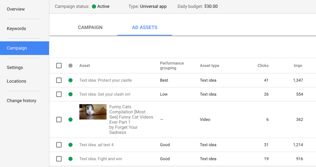
Use the top navigation menu to access the asset performance report. Click “All campaigns“, then select “App campaigns“. In the page menu, click “Ad groups“, and choose the ad group you want to review. It’s that simple!
Final words
Google App campaigns can come in various dimensions, to create an effective one, advertisers should have a good understanding of the Google App campaign specs and its creative assets to put them in the right place with the right size.
>>> Read more: Google App Campaigns for Engagement to Re-engage Customers
