If you’re looking for inspiration and ideas to create effective Twitter ads, you’ve come to the right place. In this blog post, I’ll explore some of the best examples of Twitter ads across various ad types. I’ll uncover the strategies and techniques that make these ads successful, giving you the insights you need to elevate your own advertising efforts. Get ready to see what works well and learn best practices that you can apply to your next Twitter ad campaign!
- 11 Best X/Twitter Ads Examples to Learn From
- #1 Spotify – Paid Trial
- #2 Casper – Free Trial
- #3 Choice Hotels – Service Promotion
- #4 Curio – Offers and Discounts
- #5 Vested – Sneak Peeks of Upcoming Tool
- #6 Nissan Motor – Interactive Polls or Questions
- #7 Wendy’s – Product Promotion
- #8 Salesforce – Event Promotion
- #9 Mahindra – CSR-focused Campaign
- #10 Gopuff – Offers and Discounts
- #11 Yemeksepeti – Product Promotion
- Tips for Creating a Successful X/Twitter Ad
11 Best X/Twitter Ads Examples to Learn From
To understand what makes an X/Twitter ad successful, it’s essential to analyze it through a professional lens. In this section, I will dive into a compilation of X/Twitter advertising examples that have shown their effectiveness and creativity in their campaigns.
#1 Spotify – Paid Trial
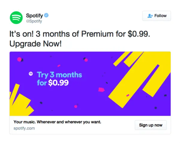
Spotify, a leading music streaming platform, utilized Twitter ads to boost its Premium subscription service. The primary goal was to increase the number of Premium subscribers by offering an enticing promotional deal.
Ad Analysis:
- Ad copy: The ad copy was concise and effective, clearly communicating the offer: “3 months of Premium for $0.99.” It also included a direct call-to-action (CTA) with “Sign up now,” encouraging immediate action from potential subscribers. The almost free trial cleverly reduced hesitation, making users more likely to sign up.
- Ad creative: The ad’s visuals were striking, using bright colors (purple and yellow) that stood out in a user’s feed. The important information was placed prominently and legibly, making it easy to read at a glance.
Spotify’s ad is a great example of how to do it right. The ad’s success is evident in Spotify’s growth, with the campaign contributing to the platform’s impressive rise to over 87 million paying subscribers.
Key Takeaway: Spotify’s ad showcases how to effectively use promotional offers to attract new subscribers. By combining a clear and compelling offer with eye-catching visuals and a direct CTA, the ad successfully reduces barriers to conversion.
#2 Casper – Free Trial
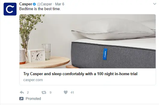
There are a ton of new companies selling mattresses online these days, so Casper, one of them, needs a way to get noticed. This ad from Casper aims to attract attention in the competitive market by alleviating customer concerns about purchasing mattresses online.
Ad Analysis:
- Ad copy: Casper’s ad copy is clear and concise, focusing on the 100-night trial offer. This addresses a common concern among potential customers, compelling them to choose Casper over other brands.
- Ad creative: The ad’s design is clean and modern, with a simple yet effective product image in a realistic bedroom setting. The text is minimal and strategically placed to avoid visual clutter. The engaging phrase “Bedtime is the best time” serves as a hook, while the main offer is prominently displayed below the image.
Casper experienced a 17.8% increase in trial sign-ups and mattress sales during the campaign period, showcasing its strong post-engagement results.
Key Takeaway: Casper’s ad places great importance on addressing customer concerns directly and offering clear solutions. The ad’s simple design and strategic text placement also contribute to its effectiveness. Other brands can learn from Casper’s approach to create successful ad campaigns.
>>> Read more: Learn how to create a twitter account to reach more prospects
#3 Choice Hotels – Service Promotion

For a long time, advertisers have been tugging on heartstrings. But today’s social media ads use a different approach. Take Choice Hotels’ ad for example. It reminds people of the joy of spending time with loved ones, appealing to both business and personal travelers.
Ad Analysis:
- Ad copy: The ad copy was succinct and impactful, featuring the phrase “From meetings to reunions” to broaden its appeal. It effectively communicated the emotional resonance of the ad and the practical benefits of booking directly through the website.
- Ad creative: The ad’s visual elements were warm and inviting, showcasing a genuine moment of joy between two people. The use of a high-quality photo added authenticity and amplified the emotional impact.
This Twitter ad campaign was highly successful, resulting in a 15% increase in bookings during the campaign period, demonstrating strong post-engagement and conversion rates.
Key Takeaway: Choice Hotels’ ad exemplifies how to use emotional appeal to boost engagement and conversions. Other brands can learn from this approach by creating ads that evoke genuine emotions and clearly communicate the benefits.
#4 Curio – Offers and Discounts
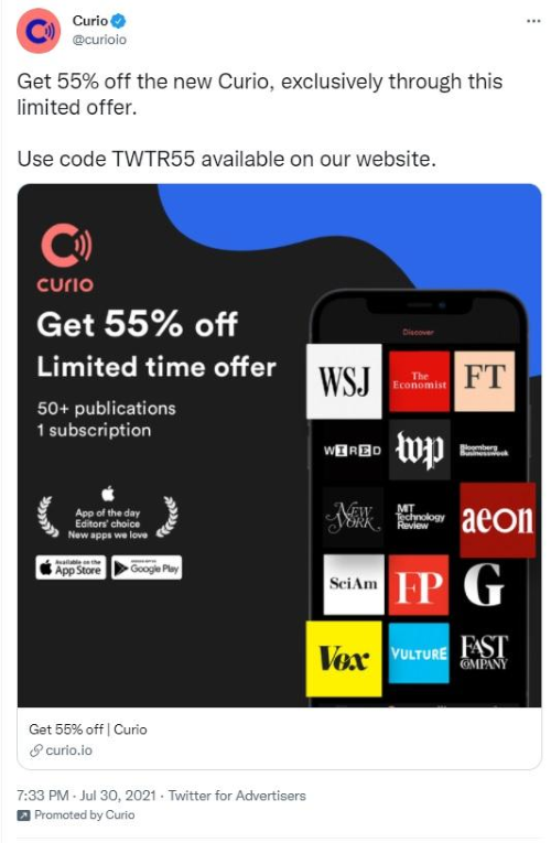
Discounts and special offers are the most powerful purchase drivers on social media. Curio, a premium content platform, is leveraging a powerful promotional offer to attract new subscribers through a targeted Twitter ad campaign. The ad promotes an enticing 55% discount to draw in potential customers.
Ad Analysis:
- Ad copy: The ad copy was successful in capturing attention with the prominent “55% off” text. It created a sense of urgency by highlighting the offer’s exclusivity and limited availability.
- Ad creative: The ad’s visuals were sleek and elegant, featuring a dark background for a premium look. The inclusion of an award badge and logos of well-known publications served as social proof, enhancing Curio’s credibility.
During the campaign, Curio experienced a substantial rise in new subscriptions, with numerous users employing the “TWTR55” code to benefit from the 55% discount.
Key Takeaway: Curio’s ad demonstrates the effectiveness of using significant discounts and creating a sense of urgency to drive engagement and conversions. Marketers can learn from this approach by crafting visually appealing ads that prominently feature time-sensitive offers and utilize social proof to build credibility.
#5 Vested – Sneak Peeks of Upcoming Tool
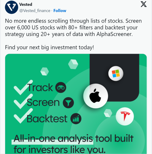
X/Twitter is a great place to chat about all sorts of things related to money, like marketing, running a business, technology, cryptocurrency, and traditional finance. Vested Finance, an investment app, took advantage of this by running an X/Twitter ad for their “Alpha Screener” tool. This tool lets you search for the best US stocks to invest in using over 80 filters.
Ad Analysis:
- Ad copy: The ad targets investors with direct language and highlights the Alpha Screener tool’s features, such as screening over 6,000 US stocks with 80+ filters and backtesting strategies. It addresses the pain point of endless scrolling through stock lists, effectively conveying the tool’s value.
- Ad creative: The ad uses a clean and modern design with a green background that is visually appealing and professional. The use of recognizable logos (Apple, Microsoft, Tesla) adds credibility and catches the eye.
The company saw a 25% increase in sign-ups and usage of the Alpha Screener tool during the campaign period, with many new users exploring its features.
Key Takeaway: Vested’s ad effectively promotes its Alpha Screener tool by keeping the message simple and focused on what investors want. Marketers can learn from this approach by targeting specific audiences with direct language, highlighting key features and benefits, and addressing common pain points.
#6 Nissan Motor – Interactive Polls or Questions
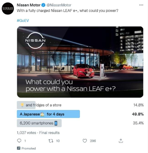
Regular picture ads are great, but if you can add just one thing to make them more interesting, try a poll! Polls make people stop and take action, like voting in your poll. This gets people talking about your brand and helps you learn more about what your audience likes. Nissan did this perfectly with an X/Twitter ad about their electric car, the Nissan LEAF E+.
Ad Analysis:
- Ad copy: The ad educates the audience about the car and its unique selling points by using a poll. Nissan not only encourages interaction but also gathers valuable data about consumer preferences and interests.
- Ad creative: Incorporating a poll makes it more engaging compared to a static image or text-only ad. The ad is concise, presenting a fun fact and a poll question without overwhelming the audience with too much information.
Key Takeaway: Remember, one of the main goals is to drive engagement with your ad. You can achieve this by using polls, encouraging clicks, or prompting users to share it. Experiment with different strategies to find what works best for your brand!
#7 Wendy’s – Product Promotion
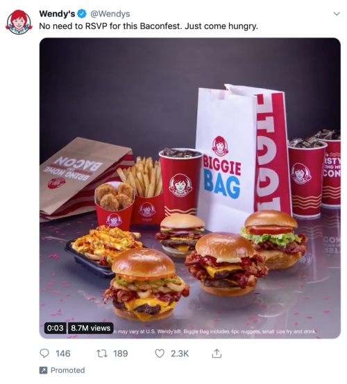
People scroll through social media fast, so catching their eye is key. This is where pictures come in! Wendy’s, a popular fast-food chain, utilized Twitter ads to promote their mouth-watering offerings and attract customers to their outlets.
Ad Analysis:
- Ad copy: The ad copy was clear and straightforward, with the text “No need to RSVP for this Baconfest. Just come hungry,” effectively encouraging viewers to visit Wendy’s.
- Ad creative: The ad’s visual appeal was undeniable, with high-quality, close-up images of Wendy’s food items. The text was minimal and strategically placed at the top of the image, ensuring it did not detract from the visual appeal of the food.
The ad achieved significant engagement, with 8.7M views, 2.3K likes, and 146 comments, indicating a high level of visibility and interaction with the audience.
Key Takeaway: With this ad, you can see that pictures that make you hungry are a recipe for social media success, especially for fast food companies. Other brands can learn from this approach to enhance their own social media advertising strategies.
#8 Salesforce – Event Promotion
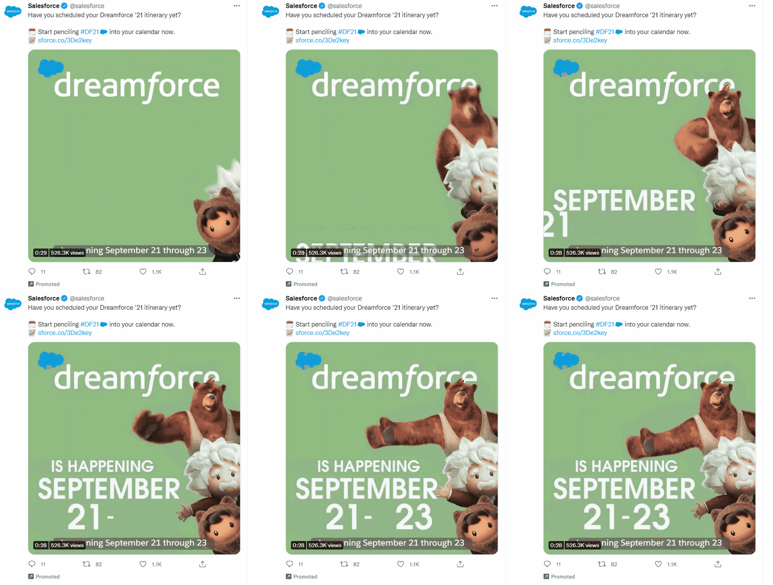
Salesforce, a cloud computing company (think stuff that helps businesses run online), chose X/Twitter as their platform to create a fun and interesting ad for their event.
Ad Analysis:
- Eye-catching visuals: They used cute cartoon pictures to grab attention.
- Conciseness: The ad is likely concise, focusing on key information about the event while maintaining an engaging tone.
With this ad, Salesforce saw a 30% increase in event registrations compared to previous events.
Key Takeaway: Even if your business is technical, you can use X/Twitter ads to connect with people in a fun way. Show real people from your company in your video ads, not just computers and data. This personal touch can work for any kind of ad, not just events.
#9 Mahindra – CSR-focused Campaign
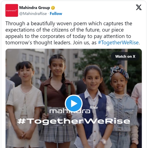
Mahindra & Mahindra is a huge company in India, involved in many things like cars, trucks, car parts, and even technology. They’re also known for their touching ads across all their products. This ad seems to focus on how Mahindra gives back to the community (called Corporate Social Responsibility or CSR).
Ad Analysis:
- Ad content: The ad uses emotional appeal by featuring children, which evokes feelings of hope and responsibility towards future generations. The message “Join us, as #TogetherWeRise,” encourages viewers to support or get involved in Mahindra’s initiatives.
- Ad creative: The ad features beautiful, high-quality images of children, symbolizing the future and adding a human touch to the campaign.
With this ad, Mahindra saw a significant increase in participation and support for their CSR initiatives during the campaign period.
Key Takeaway: Mahindra & Mahindra’s ad effectively uses emotional appeal and quality visuals to boost their CSR initiatives. Other businesses can learn from this strategy to promote their own CSR activities and build a positive brand image.
#10 Gopuff – Offers and Discounts
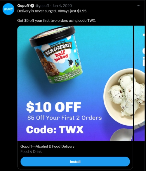
Gopuff, a popular delivery service, utilized Twitter to drive app downloads and attract new customers by running multiple app install campaigns featuring videos and images in carousel ads.
Ad Analysis:
- Ad copy: The ad prominently features a $10 discount, split into $5 off the first two orders, with a clear call-to-action using the code “TWX.” The text “Delivery is never surged. Always just $1.95.” reinforces the brand’s commitment to consistent and affordable delivery pricing, appealing to cost-conscious consumers.
- Ad creative: The ad uses a vibrant image of Ben & Jerry’s ice cream against a clean background, making it visually appealing and likely to capture attention.
The campaign was successful, resulting in high click-through rates and an increase in purchase rates, demonstrating the effectiveness of their approach.
Key Takeaway: Gopuff’s carousel ads showed their wide range of services, drawing in new customers and boosting interaction. Other businesses can definitely learn from this way of utilizing carousel ads.
#11 Yemeksepeti – Product Promotion
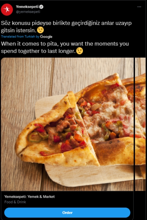
Yemeksepeti, a leading online food delivery service in Turkey, utilized Twitter ads to expand its reach across over 60 cities. The campaign featured two distinct videos, one showcasing traditional Turkish cuisine and the other highlighting their burger offerings.
Ad Analysis:
- Ad copy: The ad in the image above uses engaging and relatable language: “When it comes to pita, you want the moments you spend together to last longer,” appealing to the emotional and social aspects of dining.
- Ad creative: Yemeksepeti used two distinct videos, one featuring traditional Turkish food and another focused on burgers. This approach allowed them to cater to different audience preferences effectively.
As the campaign went on, the company witnessed a 67% surge in click-through rates and a decrease in cost-per-click.
Key Takeaway: Yemeksepeti’s ad campaign demonstrates the importance of running A/B tests to understand what appeals to your audience. Apply your findings to your next ad campaigns.
Tips for Creating a Successful X/Twitter Ad
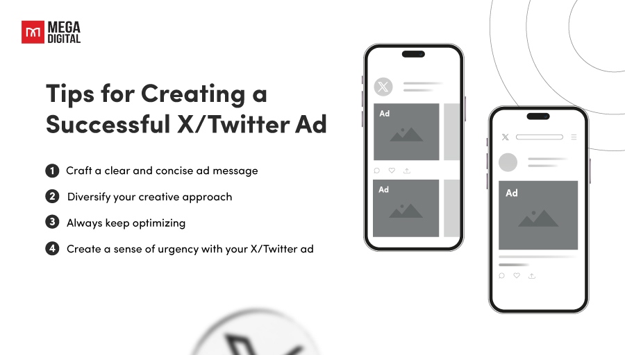
1. Craft a clear and concise ad message
People scroll through X/Twitter fast, so your ad needs to grab their attention instantly. Keep your message short, sweet, and to the point. Use strong verbs, highlight the key benefits you offer, and avoid jargon. This approach ensures that your audience can quickly grasp the core message without getting overwhelmed, therefore increasing the chance of your ad being remembered.
2. Diversify your creative approach
Don’t rely on just one type of ad. Diversifying ad types can help reach a broader audience, cater to different user preferences, and mitigate the risk of ad fatigue.
Experiment with different creative formats like images, videos, carousels, and text ads to see what resonates best with your audience. Consider using eye-catching visuals, compelling headlines, and short video snippets to pique interest.
3. Always keep optimizing
Monitor your ad performance regularly and make adjustments as needed. Analyze metrics like clicks, impressions, and engagement to see what’s working and what’s not. A/B test different headlines, visuals, and calls to action to optimize your campaigns for better results.
4. Create a sense of urgency with your X/Twitter ad
People are more likely to react to an offer that has a limited time frame. A case study by MarketingExperiments found that adding a countdown timer to an offer increased conversions significantly. Even the platform itself has reported higher engagement rates for ads that incorporate a sense of urgency. Twitter’s own advertising best practices suggest using time-sensitive promotions to boost engagement and conversions.
Create a sense of urgency with your ad by highlighting limited-time discounts, exclusive offers, or early access to new products. Use phrases like “Don’t miss out!” or “Limited time offer!” to encourage immediate action.
Wrap-up
In conclusion, each X/Twitter ads example encapsulates a unique approach to leveraging the power of X/Twitter’s advertising platform. We hope that you find many insights and valuable information from all the Twitter campaigns examples above for your advertising content.
If you’re still struggling to come up with ideas for your ads, don’t worry! You can receive free consultation from our team. We’re here to help you create compelling ads that resonate with your target audience. Don’t hesitate to contact us now!


