Crafting a Facebook ad copy is not just about promoting your product or service, but about connecting with your audience and sparking interest. And this is never an easy task for any advertisers. In this article, I will guide you through the process of writing compelling Facebook ad copy that not only attracts attention but also converts.
What is inside a Facebook ad copy?
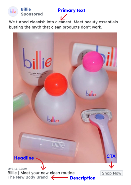
A Facebook ad copy is more than just a block of text. It’s a carefully crafted message designed to engage, inform, and persuade your audience. Here’s a breakdown of what goes into a compelling Facebook ad copy:
Headline
The headline is the first thing your audience will notice when they see your ad. It should be catchy and concise, encapsulating the essence of your ad in a few powerful words.
Image/Video
Visuals are crucial on Facebook. High-quality images or engaging videos can significantly improve your ad’s performance. They can quickly capture attention, convey emotions, and leave a lasting impression on users.
Primary Text
Primary text (or body text) provides you with slightly more space to elaborate on your offering and convince users why they should care. This is where you dive into the details of your offer. It’s a chance to explain why your offering is valuable, and how it can benefit the reader.
Link Description
The link description sits right below the headline. It provides you with an opportunity to persuade your audience why they should go for the offer on display. It’s a chance to provide additional context or information about where your CTA will lead.
Call to Action (CTA)
The CTA is arguably the most important part of your ad copy. It’s where you tell your audience exactly what action you want them to take. Whether it’s “Shop Now,” “Learn More,” or “Sign Up,” your CTA should be clear, compelling, and easy to act on.
Some requirements regarding character limits for Facebook ad copy are:
- Headline: 25 characters
- Link description: 30 characters
- Primary text: 125 characters
Why does ad copy matter in Facebook ads?
While captivating visuals are undeniably important on Facebook, many underestimate the true power of compelling ad copy. In the battle for attention on a crowded newsfeed, effective ad copy is the silent weapon that separates high-performing campaigns from those destined to scroll by unnoticed. Here’s why ad copy truly matters in Facebook Ads:
- Attracts attention: When advertising on social media, grabbing the attention of users is crucial. A well-crafted ad copy can make your ad stand out, attracting the attention of potential customers.
- Communicates value: Your ad copy is where you communicate the value of your product or service. It’s where you tell your audience what you’re offering, why it’s beneficial, and how it can solve their problems or meet their needs.
- Drives action: A compelling ad copy includes a clear and persuasive CTA. This is what prompts your audience to take the desired action, whether it’s clicking on your ad, signing up for a newsletter, or making a purchase.
- Builds brand awareness: Consistent and engaging ad copy helps build brand awareness. It’s an opportunity to convey your brand’s voice, values, and personality, helping to establish a connection with your audience.
- Improves ad performance: Good ad copy can improve the performance of your ads. It can increase click-through rates (CTR), reduce cost per click (CPC), and ultimately lead to higher conversion rates.
How to write Facebook ad copy that converts
Here are some Facebook ad copy best practices to help you create an ad copy that drives conversions:
Start with audience targeting
Before crafting a single word, you need to understand who you’re crafting it for. Effective Facebook ad copy is all about relevance. The more you understand your target audience’s demographics, interests, and pain points, the better you can tailor your message to resonate with them. Conduct thorough audience research to create a detailed buyer persona. Ask yourself:
- Who are you trying to reach?
- What are their interests?
- What are their challenges?
- What are their online habits?
By understanding your audience, you can craft messaging that speaks directly to their needs and desires, making your ad copy more relevant and engaging.
Write an irresistible hook
Given the platform’s competitiveness, you only have a few seconds to capture a user’s attention before they scroll on. Your headline is your first impression in users’ eyes, so make it count. Here are some tips for crafting a captivating hook:
- Benefit-driven: Highlight the key benefits users will gain by engaging with your ad.
- Intrigue: Spark curiosity with a question or a touch of mystery.
- Urgency: Create a sense of urgency with limited-time offers or limited quantities.
- Strong verbs & power words: Utilize action verbs and words that evoke positive emotions to grab attention.
- Clarity & concision: Keep it short and sweet. Aim for around 25 characters to ensure your entire headline is visible on mobile devices.
Example: Instead of a generic headline like “We Sell Shoes,” try something more captivating like “Tired of Aching Feet? Discover Unmatched Comfort with Our Shoes!” This headline highlights a benefit (comfort), uses a strong verb (discover), and speaks directly to a potential pain point (aching feet).
Use high-quality visual elements
Visual elements play a pivotal role in attracting users’ attention. High-quality images or engaging videos can significantly improve your ad’s performance. They can quickly capture attention, convey emotions, and leave a lasting impression on users. Here’s what to consider:
- Relevance: Choose visuals that are directly related to your ad copy and resonate with your target audience.
- High quality: Use clear, crisp images or high-resolution videos that load quickly and display well on all devices.
- Emotional connection: Evoke positive emotions or a sense of urgency to encourage user engagement.
- Simplicity: Avoid cluttered visuals that overwhelm users. Keep it clean and visually appealing.
Use a clear and compelling CTA
Don’t leave users guessing about what action you want them to take after engaging with your ad. Incorporating a clear CTA is crucial for driving conversions. Here are some useful tips for creating an effective CTA:
- Clarity: Be specific about the desired action. Don’t use generic CTAs like “Learn More”. Instead, use action verbs that tell users exactly what you want them to do like “Download Now”, “Shop Now” or “Sign Up Today”.
- Action-oriented: Use strong verbs that encourage immediate action (e.g., “Get Started”, “Explore Now”).
- Urgency: Create a sense of urgency with time-limited offers or highlighting limited quantities.
Test multiple ad copy versions
What works for one audience might not work for another, so it’s important to test and optimize your ad copy based on performance. You can A/B test different ad variations, including headlines, body copy, images/videos, and CTAs, to see what resonates best with your target audience.
Avoid using words and phrases that might cause Facebook to reject your ad
There are multiple factors that could make Facebook reject your ad. Meta prohibits promoting items such as weapons, ammunition, explosives, unsafe supplements, cryptocurrencies, and any illegal items on Facebook. However, even if your product is legal, there could be other reasons for Facebook to reject your ad. Facebook may also reject your ad if there’s an error in your creative content or if it violates any of its advertising guidelines.
Your ads must adhere to Facebook’s community standards and advertising guidelines to avoid having your ad disapproved.
Optimize for Mobile
More and more people are accessing Facebook from their mobile devices. Make sure your ad copy and visuals are optimized for mobile viewing. This can improve the user experience and probably boost conversion rates.
6 Facebook ad copy examples that worked
Clearbit
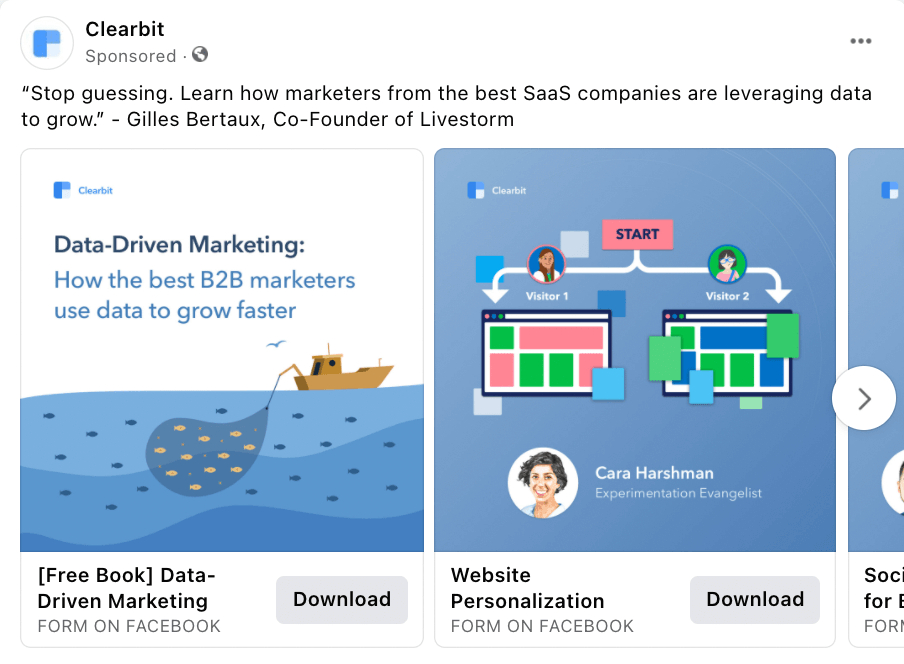
In this example, Clearbit is promoting a free ebook. If a viewer of the ad is hesitant to download immediately, they can peruse each slide for a sneak peek of the ebook’s content. What sets this ad apart is the inclusion of pictures of the experts who contributed to the ebook. And then on the final slide, they have a bright bookmark icon with a downward arrow pointing to their call-to-action.
Billie
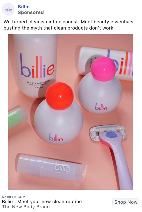
This example from Billie employs vividly colored images of their products as their ad material, and it works out so well. The striking image captures users’ attention as they scroll through their Facebook feed, causing them to stop and see what the fuss is about.
Sugergoop

Supergoop’s Facebook ad, which highlights its range of sunscreen products, is an excellent example of a slideshow ad. Creating this type of video doesn’t require a large production crew – all you need to do is collect some images or cut-outs, as demonstrated in this ad, and stitch them together using a video application.
Headspace
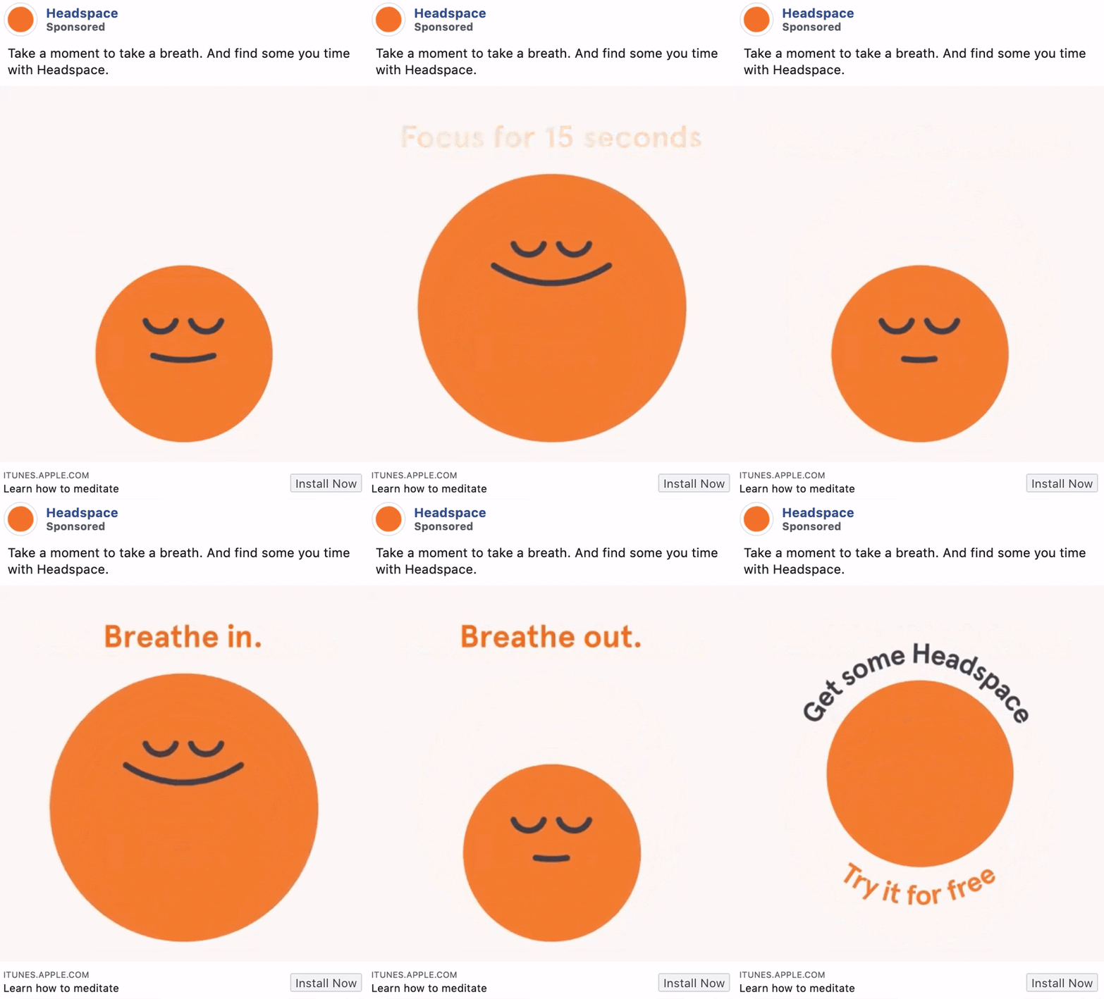
Headspace’s video ad is an excellent demonstration of how they utilize their product to craft engaging ads that capture attention and promote their product. This ad cleverly positions meditation as a means to soothe the mind. By employing shapes and straightforward text to mimic a breathing exercise, they instantly draw in their target audience and get them interested in downloading their app.
Magic Spoon Cereal
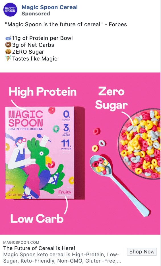
The use of emojis to add visuals to the copy in this Magic Spoon Cereal ad, together with the direct benefits of their cereal, is what makes the ad stand out. Any parent trying to get nutritious breakfast foods for their kids will immediately be captivated.
The Honest Company
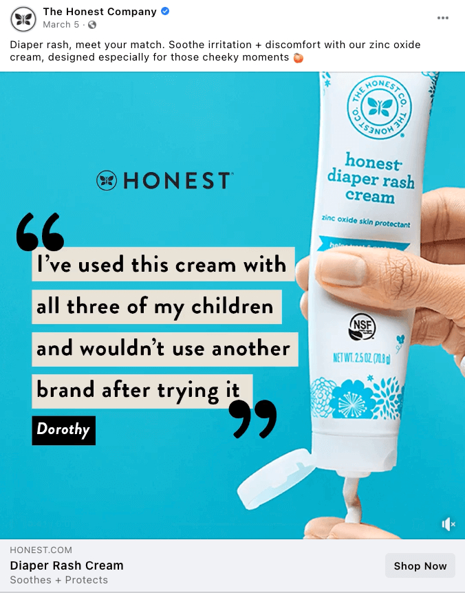
This Facebook ad image works because it has a short yet impactful testimonial paired with the product the testimonial refers to. The vibrant, uncluttered background captures the viewer’s eye, directing their focus immediately to the quote.
>>> Read more: 18 Outstanding Facebook Ad Examples (and Why It Worked)
Top 3 pitfalls to avoid when crafting Facebook ad copy
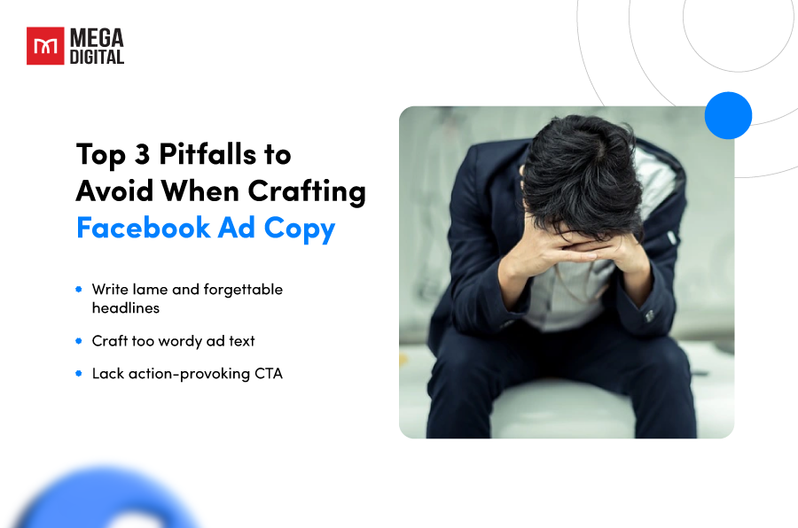
Write lame and forgettable headlines
Your headline is your golden ticket to capturing attention in a crowded newsfeed. It’s the first (and often only) piece of text users see before deciding to scroll on. A weak headline that lacks clarity, intrigue, or benefit is a missed opportunity to engage potential customers. Headlines like “Introducing Our New Product” or “Learn More About Us” are forgettable and fail to pique user interest.
What to do: Craft headlines that are clear, concise, and benefit-driven. Use strong verbs, powerful words, and a touch of intrigue to spark curiosity. Here’s an example of a stronger headline: “Get Flawless Skin in Weeks! Our Skincare Line Delivers Results.” This headline is clear (flawless skin), concise (weeks), and highlights a benefit (results).
Craft too wordy ad text
A common mistake many advertisers make is writing overly wordy and lengthy ad text. Facebook users are bombarded with content. While it’s important to provide enough information, lengthy ad copy can overwhelm users and cause them to scroll right past your message, leaving your message get lost in a sea of words.
What to do: Keep your ad copy concise and to the point. You can break up your text with bullet points or short lists to improve readability. Keep in mind that less is often more when it comes to ad copy.
Lack action-provoking CTA
Your ad copy should always include a clear and compelling CTA. This is what prompts your audience to take action, whether it’s clicking on your ad, signing up for a newsletter, or making a purchase. Without a clear CTA, your audience may not know what action to take, leading to lost opportunities.
What to do: Don’t assume users will know what to do. Include a strong CTA that tells users exactly what you want them to do next. Make it clear, actionable, and relevant to your ad’s message. Here are some strong CTA examples: “Shop Ergonomic Chairs Now!”, “Download Your Free Skincare Guide”, or “Get Your 20% Discount Today!”.
In conclusion, avoiding these common pitfalls above can significantly improve your ad performance. If you need help from experts, you can contact a trusted Facebook Partner agency, like Mega Digital. Partnering with Mega Digital, you will receive guidance that helps you craft compelling ad copy, target the right audience, and optimize your campaigns for maximum results. Don’t let these common mistakes hinder your success. Choose Mega Digital for your Facebook advertising needs and experience the difference that expert guidance can make.
Final words
Writing a Facebook ad copy that converts requires a deep understanding of your audience, a clear message, and a compelling call to action. By following the tips and best practices outlined in this article, you can create Facebook ad copy that not only attracts attention but also drives conversions. Remember, the key to successful Facebook ad copy is to keep your audience at the heart of your message.
